A few years ago, I worked on a project that involved collecting data on a variety of global environmental conditions over time. Some of the data sets included cloud cover, rainfall, types of land cover, sea temperature, and land temperature. I enjoyed developing a greater understanding of our Earth by visualizing how these conditions vary over time around the planet. To get a sense of how fun and informative it can be to analyze environmental data over time, let’s work on visualizing global land surface temperatures from 2001 to 2016.
Data
The data we’ll use in this post are NASA Earth Observation’s Land Science Team’s daytime land surface temperatures, “temperatures of the “skin” (or top 1 millimeter) of the land surface during the daytime, collected by the Moderate Resolution Imaging Spectroradiometer (MODIS), an instrument on NASA’s Terra and Aqua satellites”. Temperatures in the data range from -25 ºC (-13 ºF) to 45 ºC (113 ºF).
The data are available at resolutions of 1.0, 0.5, 0.25, and 0.1 degrees. Degrees of latitude are approximately 69 miles (111 kilometers) apart, so the 0.1 degrees files contain land temperature readings spaced approximately 6.9 miles (11.1 km) apart north and south. Unlike latitude, the distance between degrees of longitude varies by latitude. The distance is greatest at the equator and gradually shrinks to zero at the poles. For instance, at the equator, degrees of longitude are approximately 69 miles (111 km) apart; whereas, at 40º north and south, degrees of longitude are approximately 53 miles (85 km) apart. To take advantage of the most fine-grained data available, we’ll use the 0.1 degrees files in this post.
Create Environment
To begin, let’s create a dedicated folder and Python environment for this project. The following commands create a new folder named land_temperature and, inside it, another folder named input_files and then move you into the land_temperature folder:
mkdir -p land_temperature/input_files
cd land_temperature
The following conda commands create and activate a new Python 3.5 environment named land_temp that includes the listed packages, as well as their dependencies. If you’re not using the Anaconda distribution of Python, you can use the venv module in Python 3’s standard library to create a similar dedicated environment:
conda create --name land_temp python=3.5 pandas xarray scrapy matplotlib seaborn cartopy jupyter
source activate land_temp
Create Web Page URLs
Now that we’ve activated our dedicated Python environment, let’s inspect NASA NEO’s land surface temperature web page URL to determine how we’ll need to change it to access all of the web pages we need to visit. The URL for the month-level data for 2001-01-01 is:
"https://neo.sci.gsfc.nasa.gov/view.php?datasetId=MOD11C1_M_LSTDA&date=2001-01-01"
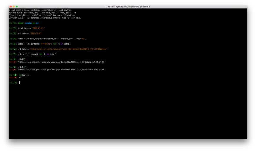
If you change the 2001 to 2002 and refresh the page, you’ll see you’re now viewing the month-level data for 2002-01-01. If you make a similar change to the month, you’ll see you’re now viewing data for a different month. It appears we can simply change the date in the URL to access all of the month-level files from 2001 to 2016. Let’s use pandas in the ipython interactive shell to generate this list of URLs:
ipython
import pandas as pd
start_date = '2001-01-01'

end_date = '2016-12-01'
dates = pd.date_range(start=start_date, end=end_date, freq='MS')
dates = [dt.strftime('%Y-%m-%d') for dt in dates]
url_base = "https://neo.sci.gsfc.nasa.gov/view.php?datasetId=MOD11C1_M_LSTDA&date="
urls = [url_base+dt for dt in dates]
Inspect Web Page HTML
Now that we have the web page URLs we need, let’s use Chrome’s element inspection tool and the scrapy interactive shell to determine how to extract the links to the data files from the web pages. To start, let’s click on the File Type dropdown menu to see what file types are available. There are several options, but let’s plan to download the type, CSV for Excel.
Below the File Type dropdown menu, there are four geographic resolution options, 1.0, 0.5, 0.25, and 0.1 degrees, which provide increasingly granular data. Let’s right-click on the tiny, right-facing arrow to the right of 0.1 degrees 3600 x 1800 and select Inspect to inspect the HTML near the link in Chrome’s element inspection tool.
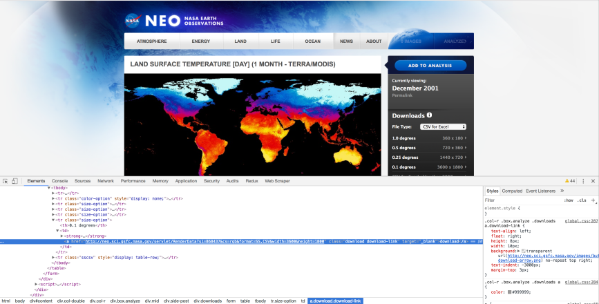
The HTML shows us the link to the data file is in a table. Moreover, the link is in a row that has class=”size-option” and, within the data cell (td) element, it is in a hyperlink (a) element’s href attribute. With this understanding of the HTML path to the data file link, let’s use scrapy’s interactive shell to figure out how to extract the link:
scrapy shell "https://neo.sci.gsfc.nasa.gov/view.php?datasetId=MOD11C1_M_LSTDA&date=2001-01-01"
response.css('tr.size-option td a::attr(href)').extract()
response.css('tr.size-option td a::attr(href)')[-1].extract()
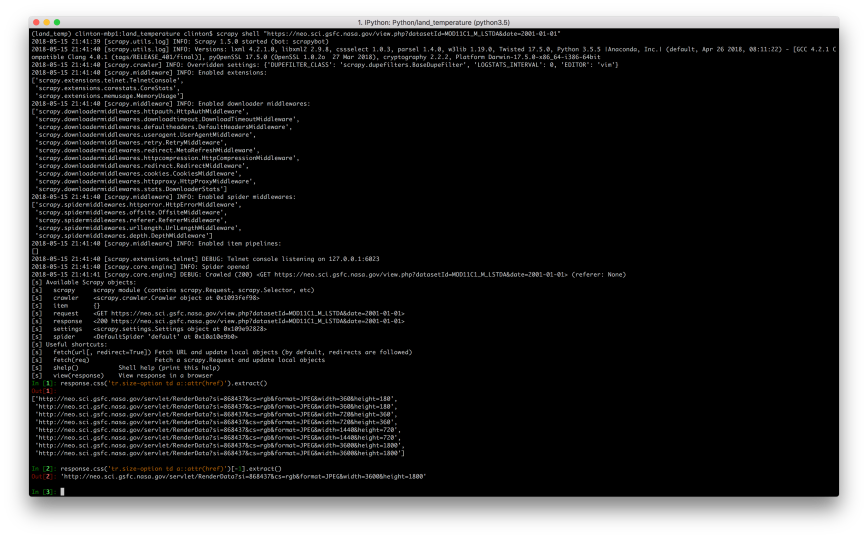
If you inspect a few of the data file links, you’ll notice an issue with them (i.e. a number in the middle of the URL that varies) that we need to address if we want to download the files programmatically:
"http://neo.sci.gsfc.nasa.gov/servlet/RenderData?si=869628&cs=rgb&format=SS.CSV&width=3600&height=1800"
In the previous section, when we generated the web page URLs, the portion of the URL that needed to change was the date at the end of the URL, and it needed to change in an understandable way. In this case, I don’t know which number is associated with each URL (and I can’t guess the underlying pattern if there is one), so I can’t generate them programmatically. Instead of generating the data file links like the web page URLs in the previous section, let’s simply scrape the actual data file links from the web pages.
Scrape Data File URLs
Now that we know how to select the data file links, let’s use scrapy to extract them from the web pages so we can then use them to download the data files. In total, there will be 192 URLs and files (12 months per year x 16 years = 192 monthly files).
From inside the land_temperature folder, type the following commands:
scrapy startproject scrape_land_temps
cd scrape_land_temps
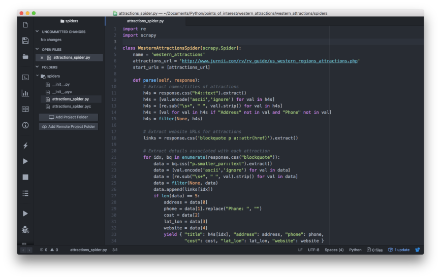
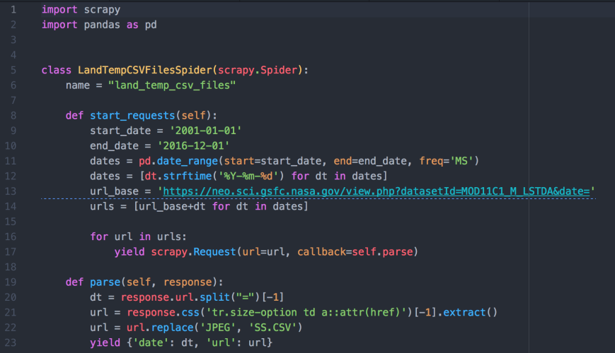
Now that we’re inside the first scrape_land_temps folder, let’s create a scrapy spider, a Python file, named land_temp_csv_files_spider.py inside the scrape_land_temps/spiders folder. In the spider, let’s combine our web page URL generation code with our href link extraction code to instruct the spider to visit each of the 192 month-level web pages and extract the link to the 0.1 degrees data file from each page. Then we can use these URLs to download the CSV files:
import scrapy

import pandas as pd
class LandTempCSVFilesSpider(scrapy.Spider):

        name = "land_temp_csv_files"
        def start_requests(self):

                start_date = '2001-01-01'

                end_date = '2016-12-01'

                dates = pd.date_range(start=start_date, end=end_date, freq='MS')

                dates = [dt.strftime('%Y-%m-%d') for dt in dates]

                url_base = 'https://neo.sci.gsfc.nasa.gov/view.php?datasetId=MOD11C1_M_LSTDA&date='

                urls = [url_base+dt for dt in dates]
                for url in urls:

                        yield scrapy.Request(url=url, callback=self.parse)
        def parse(self, response):

                dt = response.url.split("=")[-1]

                url = response.css('tr.size-option td a::attr(href)')[-1].extract()

                url = url.replace('JPEG', 'SS.CSV')

                yield {'date': dt, 'url': url}
Let’s use the following command to run the spider and extract the links to the data files. The result is a JSON file named land_temp_csv_files_urls.json that contains an array of 192 objects, each containing a date and the link to the data file associated with the date:
scrapy crawl land_temp_csv_files -o ../land_temp_csv_files_urls.json
cd ..
Download Data Files
We’re finally ready to download the 192 month-level land surface temperature data files. Let’s return to the ipython interactive shell and use the following code to iterate through the array of URLs in our JSON file to download the CSV files.
First, we read the pairs of dates and URLs in the JSON file into a dataframe named ‘df’. Next, we loop over these pairs (i.e. rows in the dataframe) and, for each one, use the URL to read the remote CSV file into a dataframe named ‘dat’ and then write the dataframe to a local file in the input_files folder.
We insert the date, e.g. 2001-01-01, into the filenames so we know which date each file represents. Also, we use try-except blocks around the reading and writing operations so the loop won’t terminate if it runs into any issues (instead, it will print messages to the screen):
ipython
import pandas as pd
df = pd.read_json('land_temp_csv_files_urls.json')
for index, row in df.iterrows():

        print(index, row['url'])

        try:

                dat = pd.read_csv(row['url'], header=0, index_col=0)

        except:

                print('Error reading: {}'.format(row['url']))

                continue
        filename = 'MOD11C1_M_LSTDA_{}_rgb_3600x1800.SS.CSV'.format(row['date'].strftime('%Y-%m-%d'))

        try:

                dat.to_csv('input_files/'+filename)

        except:

                print('Error writing: {}'.format(filename))

                continue
Combine Data
Now that we have all of our data files, let’s return to the ipython interactive shell and use the following code to read and combine all of the CSV files into a three-dimensional array (i.e. x = longitude, y = latitude, z = date):
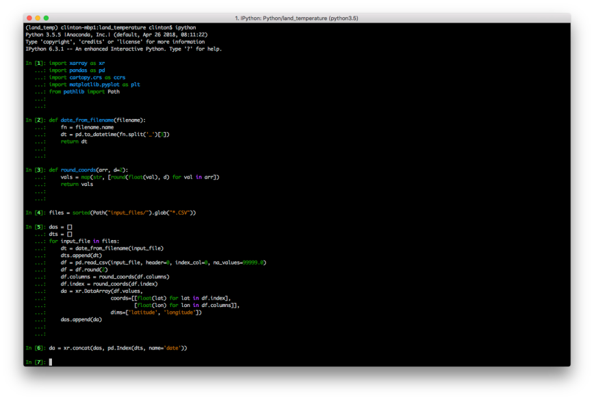
import xarray as xr

import numpy as np

import pandas as pd

import cartopy.crs as ccrs

import matplotlib.pyplot as plt

from pathlib import Path
The following code snippet is a helper function we’ll use to make the file-reading code shown below easier to read. This function takes a file name as input, splits it into pieces at the underscores, extracts the piece with index position 3 (this piece is the date, e.g. 2001-01-01), and converts the date into a datetime object:
def date_from_filename(filename):

        fn = filename.name

        dt = pd.to_datetime(fn.split('_')[3])

        return dt
The following code snippet is another helper function we’ll use to make the file-reading code easier to read. This function takes an array as input, converts all of the array elements into floating-point numbers, rounds all of the numbers to a specified number of decimal places (the default is 2 decimal places), and then converts the elements to string type:
def round_coords(arr, d=2):

        vals = map(str, [round(float(val), d) for val in arr])

        return vals
The following line of code uses the pathlib module in Python’s standard library to create and return a sorted list of paths to all of the CSV files in the input_files folder:
files = sorted(Path("input_files/").glob("*.CSV"))
The block of code shown below reads all of the CSV files and combines them into a three-dimensional array (i.e. x = longitude, y = latitude, z = date). We’ll use the list named ‘das’ to collect the 192 individual arrays. Later, we’ll pass this list of arrays to xarray’s concat function to concatenate them into a new, combined array. Similarly, we’ll use the list named ‘dts’ to collect the 192 dates so we can use them as the new dimension in the combined array.
Next, we start to loop through each of the CSV files. For each file, we use the date_from_filename function to extract the date from the filename and append it into the dts list. Next, we read the CSV file, noting that the first row is the header row of longitude values, the first column is the index of latitude values, and NA data values are coded as 99999.0. The next three lines round the data, longitude, and latitude values to two decimal places.
Next, we input these values into xarray’s DataArray constructor to create a two-dimensional array and add it to the das list. Finally, we use xarray’s concat function to combine the 192 two-dimensional arrays into a three-dimensional array with the new dimension named ‘date’:
das = []

dts = []

for input_file in files:

        dt = date_from_filename(input_file)

        dts.append(dt)

        df = pd.read_csv(input_file, header=0, index_col=0, na_values=99999.0)

        df = df.round(2)

        df.columns = round_coords(df.columns)

        df.index = round_coords(df.index)

        da = xr.DataArray(df.values,

                coords=[[float(lat) for lat in df.index], [float(lon) for lon in df.columns]],

                dims=['latitude', 'longitude'])

        das.append(da)
da = xr.concat(das, pd.Index(dts, name='date'))
At this point, we should have a three-dimensional array named ‘da’ we can use to analyze and visualize land surface temperatures from 2001 to 2016. Let’s check to make sure the array has the expected dimensions and appears to have the right content:
da.shape
da
The temperature values are in degrees Celsius. Nearly everyone in the world learns this temperature scale, except for people in the United States. Since many readers live outside the United States, I’m going to leave the values in degrees Celsius; however, converting them to degrees Fahrenheit is straightforward:
da.values = (da.values * 1.8) + 32

da = da.round(2)
Average Land Surface Temperatures
xarray extends pandas and numpy functionality to facilitate multi-dimensional indexing, grouping, and computing. As an example, we can calculate the average land surface temperatures across all 192 months and display them on a map with the following code:
da.mean(dim='date').plot(figsize=(10, 6));

plt.show()
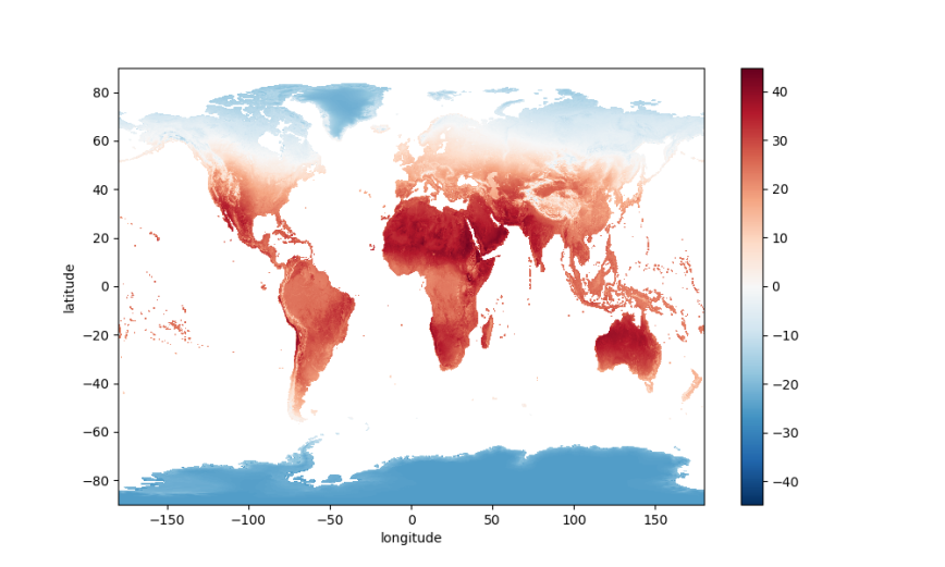
The PlateCaree projection is a nice default, but let’s explore some other map projections.

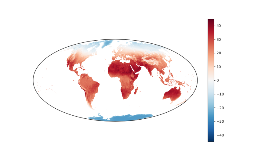
Remembering the scene about projections in the television show, The West Wing, here is the same data displayed on a map with the Mollweide projection:
plt.figure(figsize=(10, 6))

ax_p = plt.gca(projection=ccrs.Mollweide(), aspect='auto')

da.mean(dim='date').plot.imshow(ax=ax_p, transform=ccrs.PlateCarree());

plt.show()
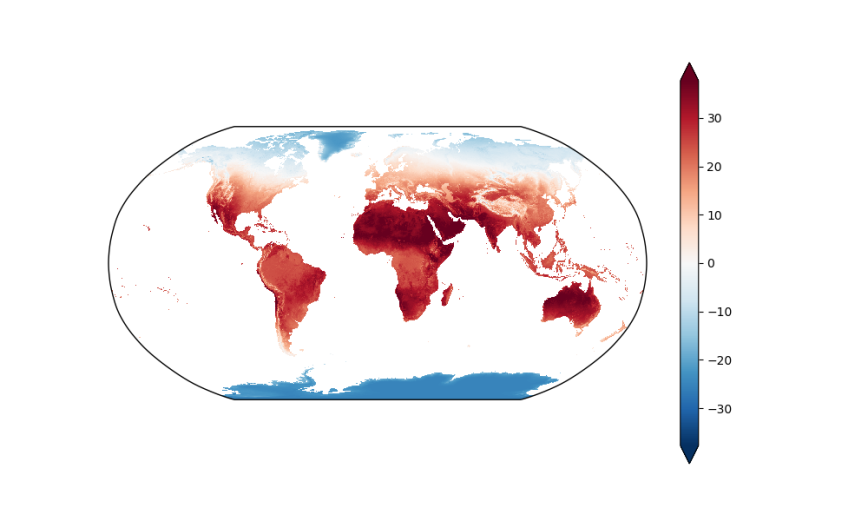
As an additional example, the following code block displays the data on a map with the Robinson projection. This example also illustrates some of the additional arguments you can supply to the plot.imshow function to customize the plot:
fig = plt.figure(figsize=(10, 6))

ax = fig.add_subplot(111, projection=ccrs.Robinson(), aspect='auto')

da.mean(dim='date').plot.imshow(ax=ax, transform=ccrs.PlateCarree(),

                x='longitude', y='latitude',

                robust=True, # vmin=-25, vmax=40,

                cmap='RdBu_r',

                add_colorbar=True,

                extend='both');

plt.show()
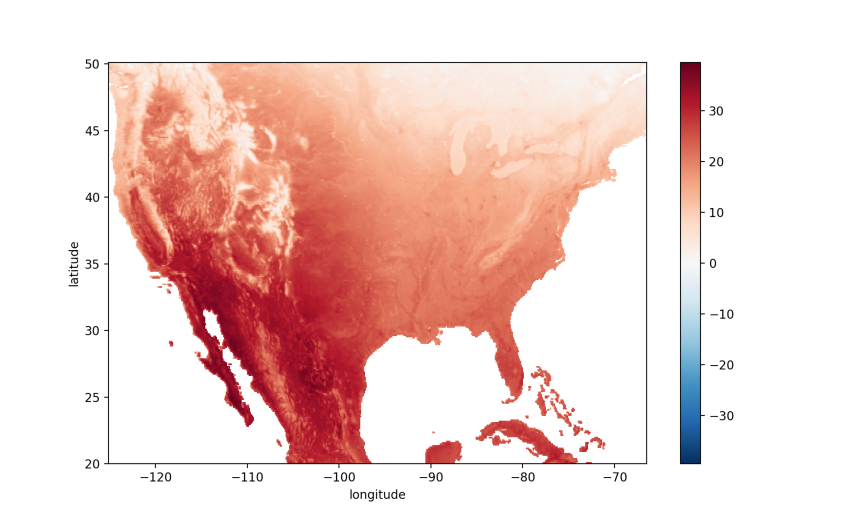
By Specific Geographic Area
The previous examples displayed maps of the entire Earth. In some cases, you may only be interested in a specific segment of the globe. In these cases, you can use array indexing to filter for the subset of data you want or use cartopy’s set_extent function to restrict the map to a specific geographic area.
If you use array indexing, be sure to check the ordering of your array’s axes so you place your index values or ranges in the right positions. For example, in our ‘da’ array the ordered dimensions are date, latitude, and longitude (which we can check with da.shape), so the indexing in the following command selects all dates, latitudes between 20.05 and 50.05, and longitudes between -66.50 and -125.05:
usa = da.loc[:, 50.05:20.05, -125.05:-66.50]

usa.mean(dim='date').plot();

plt.show()
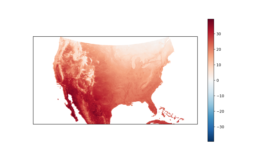
Alternatively, we can use cartopy’s set_extent function to restrict the map to a specific segment of the globe:
plt.figure(figsize=(10, 6))

ax_p = plt.gca(projection=ccrs.LambertConformal(), aspect='auto')

ax_p.set_extent([-125.05, -66.50, 20.05, 50.05])

usa.mean(dim='date').plot.imshow(ax=ax_p, transform=ccrs.PlateCarree());

plt.show()
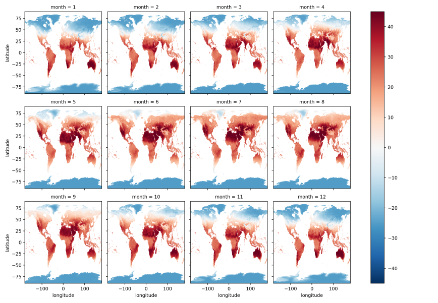
By Month of the Year
The previous plots calculated average land surface temperatures across all 192 months, which doesn’t let us see temperature differences among months of the year, i.e. January, February, …, December. To calculate average temperatures for each month, we can use xarray’s groupby function to group our data by month of the year and then calculate average temperatures for these groups:
by_month = da.groupby(da.date.dt.month).mean(dim='date')

by_month.plot(x='longitude', y='latitude', col='month', col_wrap=4);

plt.show()
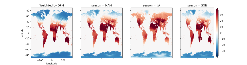
By Season
In xarray’s documentation, Joe Hamman demonstrates how to calculate season averages with weighted averages that account for the fact that months have different numbers of days. Slightly adapting his code for our dataset, we can view how global land surface temperatures vary across seasons (to run the code shown below, you’ll first need to copy and paste Joe’s dpm dictionary and leap_year and get_dpm functions):
month_length = xr.DataArray(get_dpm(da.date.to_index(), calendar='noleap'),

                coords=[da.date], name='month_length')

weights = month_length.groupby('date.season') / month_length.groupby('date.season').sum()

np.testing.assert_allclose(weights.groupby('date.season').sum().values, np.ones(4))
da_weighted = (da * weights).groupby('date.season').sum(dim='date')
fig, axes = plt.subplots(nrows=1, ncols=4, figsize=(15,4))

for i, season in enumerate(('DJF', 'MAM', 'JJA', 'SON')):

        if i == 3:

                da_weighted.sel(season=season).plot(

                        ax=axes[i], robust=True, cmap='RdBu_r', #'Spectral_r',

                        add_colorbar=True, extend='both')

        else:

                da_weighted.sel(season=season).plot(

                        ax=axes[i], robust=True, cmap='RdBu_r',

                        add_colorbar=False, extend='both')
for i, ax in enumerate(axes.flat):

        if i > 0:

                ax.axes.get_xaxis().set_ticklabels([])

                ax.axes.get_yaxis().set_ticklabels([])

                ax.set_ylabel('')

                ax.set_xlabel('')
axes[0].set_title('Weighted by DPM')
Looping through Months of the Year
The previous examples generated static images. While you can certainly scan over the month of year and season-based plots to inspect differences among the time periods, it can be helpful to generate the plots in a loop so you can focus on a geographic area of interest and let the program handle transitioning from one time period to the next.
Since we’re going to loop over time periods, e.g. months of the year, I’d like to label each plot so we know which time period is being displayed. In our dataset, the months are numbered from 1 to 12. I want to be able to refer to January instead of month 1, so let’s create a dictionary that maps the month number to the corresponding name:
months = {

        1: 'January',

        2: 'February',

        3: 'March',

        4: 'April',

        5: 'May',

        6: 'June',

        7: 'July',

        8: 'August',

        9: 'September',

        10: 'October',

        11: 'November',

        12: 'December'

}
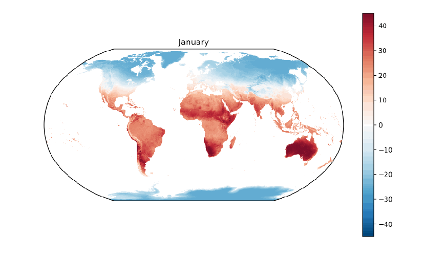
Next, let’s write a function that will generate each plot, e.g. one for each month of the year. Inside the function, let’s use matplotlib’s clf function to clear the current figure, create a plot axis with the Robinson projection, filter for the subset of arrays with the specified month of the year, create a plot of the average land surface temperatures in the month across all sixteen years, and finally use the name of the month as the plot title:
def plot_monthly(month_number):

        plt.clf()

        ax_p = plt.gca(projection=ccrs.Robinson(), aspect='auto')

        d = da.loc[da.date.dt.month == month_number]

        d.mean(dim='date').plot.imshow(ax=ax_p, transform=ccrs.PlateCarree())

        plt.title('{}'.format(months[month_number]))
To generate the twelve month-based plots, let’s use matplotlib’s ion and figure functions to turn on matplotlib’s interactive mode and to create an initial figure. Next, let’s establish a for loop to iterate through the integers 1 to 12. As we loop through the integers, we’ll pass each one into our plot_monthly function so it creates a plot based on the data for that month. Since we’re using interactive mode, we need to use matplotlib’s pause function, which pauses the figure for the specified number of seconds, to facilitate the transition behavior. Similarly, we need to use the draw function to update the figure after each transition:
plt.ion()

plt.figure(figsize=(10, 6))

for month in range(1,13):

        plot_monthly(month)

        plt.pause(0.1)

        plt.draw()
Conclusion
This post demonstrated how to acquire, analyze, and visualize sixteen years’ worth of global land surface temperature data with Python. Along the way, it illustrated ways you can use xarray, matplotlib, and cartopy to select, group, aggregate, and plot multi-dimensional data.
The data set we used in this post required a considerable portion of my laptop’s memory, but it still fit in memory. When the data set you want to use doesn’t fit in your computer’s memory, you may want to consider the Python package, Dask, “a flexible parallel computing library for analytic computing”. Dask extends numpy and pandas functionality to larger-than-memory data collections, such as arrays and data frames, so you can analyze your larger-than-memory data with familiar commands.
Finally, while we focused on land surface temperature data in this post, you can use the analysis and visualization techniques we covered here on other data sets. In fact, you don’t even have to leave the website we relied on for this post, NASA’s NEO website. It offers dozens of other environmental data sets, categorized under atmosphere, energy, land, life, and ocean. This post only scratched the surface of what is possible with xarray and NASA’s data. I look forward to hearing about the cool, or hot, ways you use these resources to study our planet : )